It all starts with an idea, a positioning and then a name. An identity, brand style and tone of voice all followed, along with consultancy on signage, interiors and social - then Tryst was borne. From letterpress business cards to embossed and foiled notelets - everything came down to the detail. Thanks to all the team #wearebrill #katiequinnphotography #glasgowpress #impressprinters
A new concept for KCPeaches - which started with name generation, descriptor and positioning, then of course, a search and registration. Based on Thomas Street in Dublin and very much aimed at the student budget and casual dining, faction had to work closely with the interior designer to ensure a perfect fit of brand and space. Signage, uniforms, menus and social all were considered - the proof of course…
Based on the Galley Head - Clonakilty Distillery came to faction to develop a brand - they had a name, products and an idea on positioning but needed a helping hand to develop something that could live, walk and talk with a certain style on both sides of the Atlantic (to start with). Taking some great creative work on the bottle and brand from Craig at Breeze Creative based in Glasgow - we commissioned photography, copy and print to take this brand to a new level.
We then needed to develop product-specific material for both the Minke Gin and Whiskey range along with designing areas within the Visitor Centre in the heart of Clonakilty - which included the shop, Whale’s Tail Bistro, welcome area and signage. A beautiful project in a beautiful part of the world. Great work from the whole team: #breeze-creative #andrewbradleyphotography #denisgoodbody #laszloboros
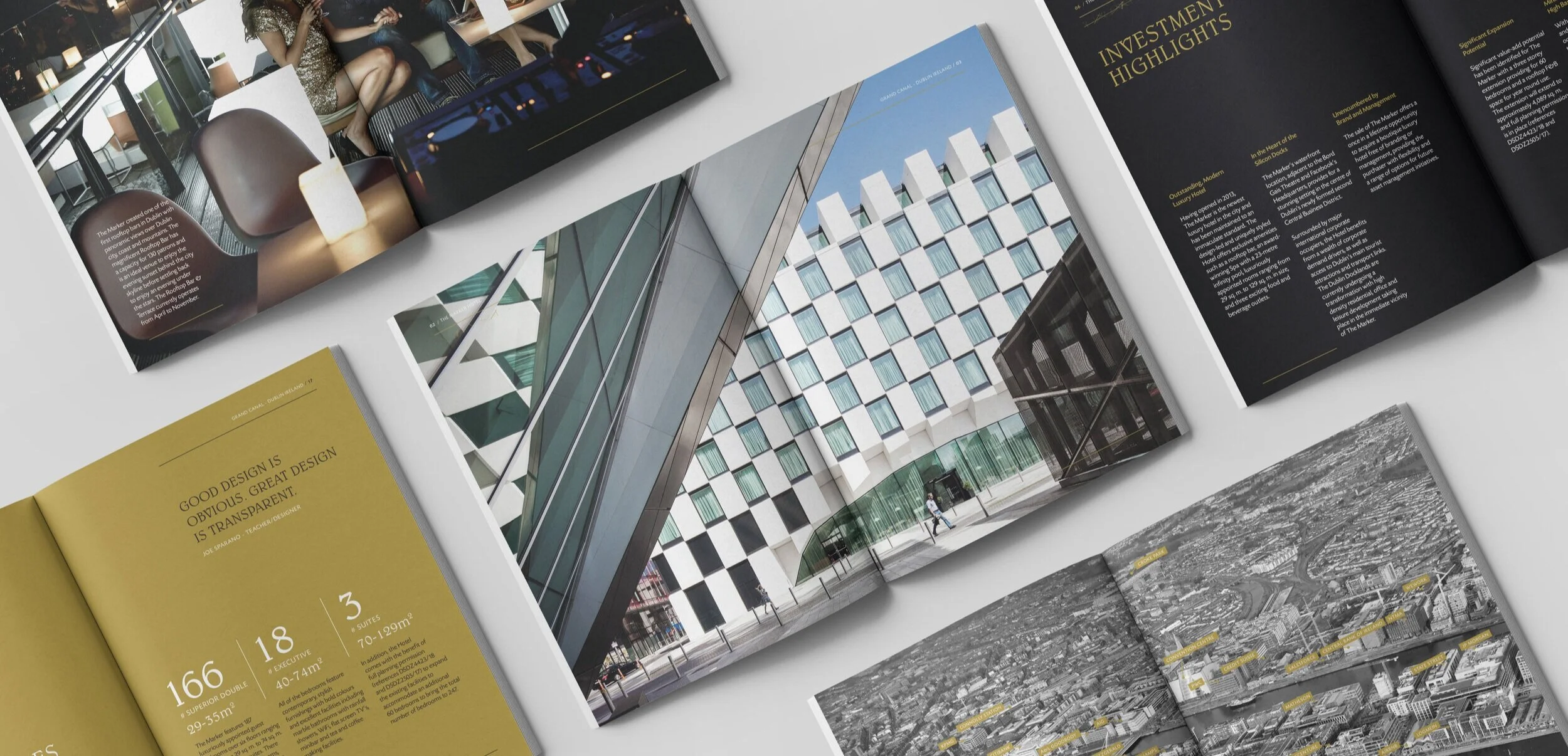
Developing an experience - show that we are luxury, 5 star, Dublin was the brief. “Nah! just do a pdf” said someone around the table! Kevin McGillykuddy at Brehon Capital didn’t agree. Over the past number of years, we had developed a great brand along with a huge collection of stylish assets (developed mainly by Andrew Bradley Photography) and this was a chance to show them in all their splendour.
An outer poster in Curious Metallic Alchemy Gold 120gsm, foiled in black - illustrates the strong geometric architectural design of the hotel - peel back the foiled low tack sticker to unfold a snapshot of Dublin insights, for the international traveler.
Enveloped by the gold poster, a booklet, housed in an embossed and black foiled - black on black cover. This unique sized brochure contains beautifully printed photographs and minimal words to help the future buyer understand The Marker Hotel and its environs.
#brehoncapital #andrewbradleyphotography #impressprinters
So no we didn’t do the name or the mark - this was developed by JHP in London and then was developed while I was working for Neworld as Design Director. Over the past number of years in faction - we have developed the brand further - staying true to the roots of less is more, minimal colour palette and a high attention to detail, design and finishing.
Shoreline Hotel, a rebranding of the Waterside Hotel, Donabate - is set right on the beach next to one of the Martello Towers that adorn our Irish coastline.
We wanted to embrace our surroundings, colours, textures patterns and fun tone of voice, are all used to bring the brand alive - we even use driftwood for the room key fobs!
Just the start of the story. Wolf and Pickle started as one of four names developed for this brand - both words associated with food and eating and passing the searches and legals - so now the creative juices could start flowing - we knew it had to be different.
The fork and knife were loved from the start and gave us endless possibilities with patterns, colours and TOV (thanks Jonathan Hoblyn). Working closely with wearebrill we soon developed a look and feel for interior messaging and then rolled the brand out over packaging, signage, uniforms, POS, coffee and much more…
#wearebrill #copydesk@copywriter #gaelitesigns
Taking Kettyle to the next level - while all around us look at Dry Ageing as a matter of fact. This has been our purpose for the past five years - working closely with the Kettyle team on projects like our Guinness Burger range and other associated products. To have been involved with Meatopia and its summer madness in the Open Gate, along with working on NPD and day to day needs of our European and Asian clients - it’s definitely worth its salt!
Unfortunately, Investec has left our shores - but these quarterly reviews were designed to go out to their high net worth clients - informing them of the twists and turns, ups and downs in the market place. Each publication was unique in spot colour and zebra (yes each had a name) and delivered on a tight timeline.
Well, this has been a journey, an ongoing journey that will and has created multiple brands, packaging, ideas and surprises. From labels on bags of flour to tented foodie villages, standing on ancient Irish soil sites to shooting photos in Powerscourt. Talking to chefs and their needs to creating furniture and POS for instore bakeries - let the adventure continue….
We have worked with Sisk for nearly 20 years now - starting on their Annual Reports and moving on to Sisk Healthcare and now to Sisk Living - building communities.
And in our ever-changing world helping HR with its publications - that make sure we look after our colleagues.
You know one of those briefs that come in - yes I know its only a week or two. Artistic freedom with an insight that it will be used on menus and that we have no photography - fast food, but quality and aimed at kids and their parents (usually the Mums). The Cove Burger Co was designed and implemented over a short period of time - menus and uniforms and a fun tone of voice - quicker than you can say Burger!
A simple identity and one of the first for Faction - something professional with a twist of creativity - we still like it!
Raglan Road - an Irish oasis in Disney - we don’t do Leprachauns here but we work with the team to put on a clever Irish twist. Even the wiro bound training manual you see here plays with Irish imagery and sayings. From menus to social, ponchos to plectrums you would be surprised what we have created for the team in Florida.
Involved in the beginning with the rollout of the brand, designed by JHP in London - but recently commissioned to look after Christmas for them still love that identity.
Some of the brands we have created over our lifetime.